New regulations under the California Consumer Privacy Act (CCPA) have introduced a ban on the use of dark patterns on the internet. You may or may not know what are dark patterns, but you come across a ton of them every day. That’s what brings us to talk all about dark patterns and how websites use them to trick you.
What Are Dark Patterns?
Dark patterns are tricks or design layouts used by websites and apps to make you do something you didn’t mean to do. Sites also use them to make it difficult for you to opt-out of a subscription or share your personal information that you may not share otherwise.
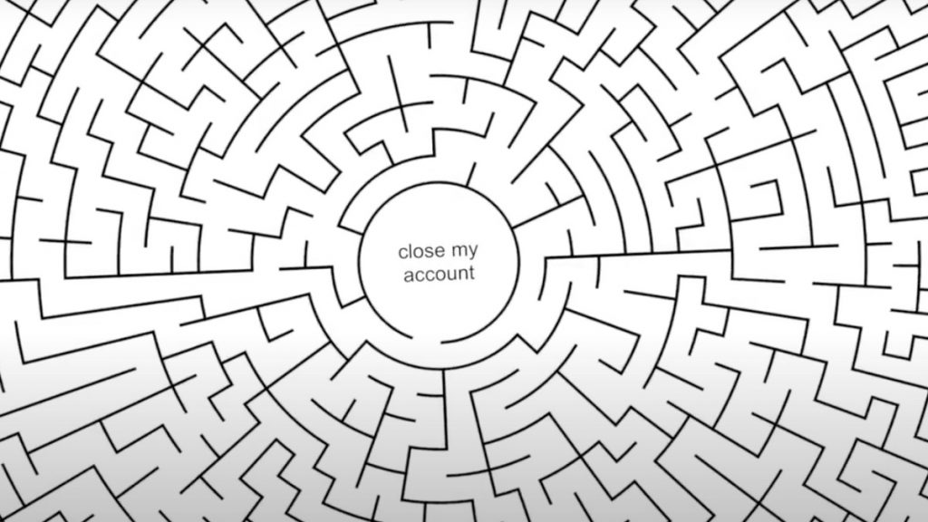
A classic example of dark patterns is when you want to delete an Amazon account. You can sign up for Amazon in less than 4 clicks, but you’ll need to go through at least 6 clicks across 5 pages (including guesswork in selecting categories) and then chat with a representative if you want to close your Amazon account. Check out the video above to see this example in action.
Types Of Dark Patterns
There are several types of dark patterns that you may come across on a daily basis. You can read in-depth about all types of dark patterns here. However, I have a few personal favorites that I think deserve a mention here.
Privacy Zuckering
Named after none other than Mark Zuckerberg, this dark pattern is about sharing more information with Facebook than you really intended. It has happened to most of us at one point or the other.
Roach Motel

The roach motel dark pattern is when you can easily sign up for something but can’t opt-out with the same ease. It is done to frustrate you into continuing the subscription, never leaving the maze.
Sneak Into Basket
The oldest trick up Amazon’s sleeve. Sneak into basket happens when you’re ordering something online, and something else from your wish list or a previous cart gets added automatically. Unless you uncheck it, you’ll end up buying something you may have saved for later.
Confirmshaming

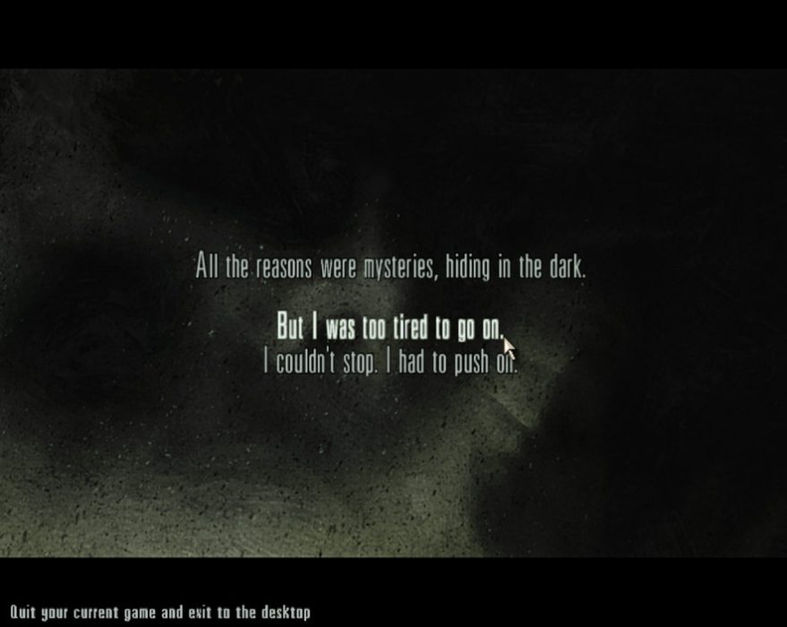
When a subscribe button says “I’m Awesome!” and the unsubscribe button says “I’d rather be a loser,” that’s confirmshaming. If you ever played Max Payne and noticed the ‘quit game’ screen, the option to exit says “but I was too tired to go on,” which may force you to play a few extra hours at the loss of something else.
Are Dark Patterns That Bad?
90 out of 100 times you may not want to delete an account or unsubscribe from an email. But for the sake of that one time when you’re motivated enough to save some money by deactivating a subscription, dark patterns come into play.
A major reason why websites and apps resort to these tactics is that they allow them to retain consumers. Call these the lucrative offers of the internet, but then again, they have their own downside, and it is that you can’t let go of service as easily as you started using it. So for equality’s sake, dark patterns need to go.
What Is The CCPA Ban On Dark Patterns?
Now that you know the basics of dark patterns and how they work, let’s talk about what has happened here. The CCPA has approved additional regulations that ban websites from using them. This means the sites now have to offer a clean and clear interface to users in California.
The blue button you see in the Tweet above is designed by Carnegie Mellon university’s Cylab and the University of Michigan’s School of Information. It is called the privacy icon and websites may use it to show the privacy options available to users online.
According to the press release, the CCPA grants California consumers the right to know, the right to delete, and the right to opt-out of the sale of the personal information collected by businesses.
With the new regulations, California is one of the first states to effectively ban dark patterns. Before this, a Norwegian Consumer Council (NCC) report accused Google, Facebook, and Microsoft of using dark patterns. You can read all about it at the link below.
Also Read: Facebook And Google Accused Of Manipulating You: “Dark Patterns” In Privacy Pop Ups Revealed
Almost all major mainstream websites use dark patterns to get users and keep them hooked. Even when you’re getting promotional emails, the ‘unsubscribe’ button is well hidden in most cases. That’s what the CCPA regulations might change for users in California.
Time For Global Laws?
While California has managed to pass the regulations, Europe also has its own GDPR to deal with privacy issues with big tech. Aside from these two laws, there’s not much being done in countries with a boom of internet users. Censorship in the name of regulation is trending in some regions.
For instance, India is among the fastest-growing internet markets with relatively ambiguous privacy laws. There’s not much even on basics like data protection and encryption.
As a result, companies have different policies for Europe and California. So it is safe to say that its high time global laws on the internet came into place. While local laws of the land should always be respected, the internet is global and should remain equally accessible and safe for everyone.
The post What Are Dark Patterns? Why The California Ban Makes Sense appeared first on Fossbytes.
from Fossbytes https://ift.tt/2NnwMxT
via IFTTT


0 comments:
Post a Comment